If you’ve used the Kadence Info Box, you may have seen this happen:
This guide shows you why your Kadence Info Box layout breaks on tablet and mobile, and how to fix it by building your own custom layouts using the Kadence Row Layout and Section blocks.
Within the guide, I use the Lorem Ipsum placeholder text, you will use your own content for the text.
By the end, you’ll have:
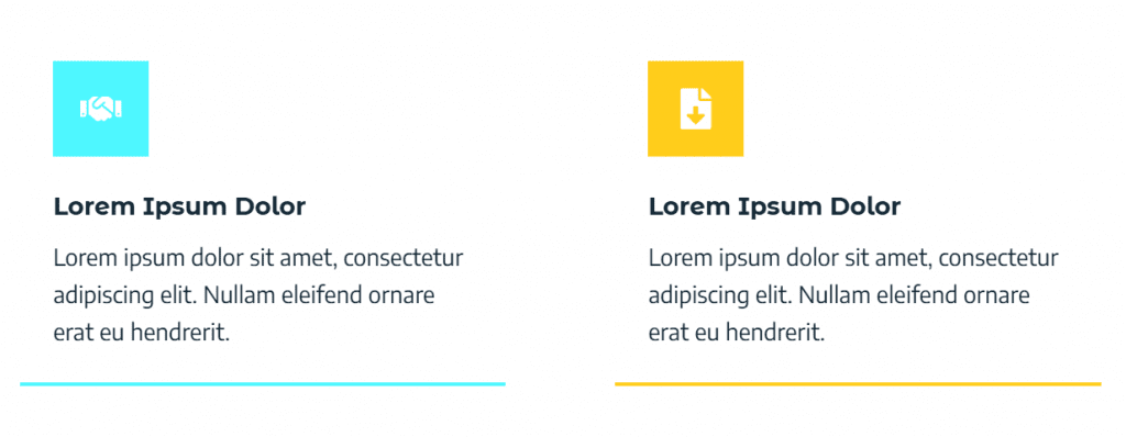
When does the default Kadence Info Box still work?
The Kadence Info Box works well when every box has:
When that’s true, your icons, titles, paragraphs and bottom borders all line up nicely across the row.
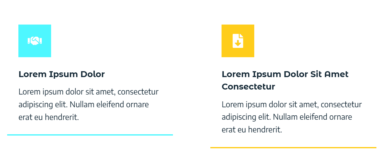
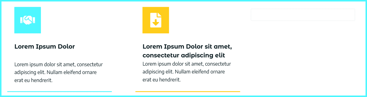
Why is my Kadence Info Box not aligned on tablet view?
If just one title wraps to two lines, or one paragraph is longer, things start to break:
Sometimes, a staggered layout can look interesting. But if you want to maintain the clean, professional alignment across screen sizes, you’ll get much better control by rebuilding the layout, instead of relying on the standard Kadence Info Box block.
You can still use the normal Kadence Info Box when:
If you; Mix long and short titles, change paragraph length often or care about pixel-clean alignment of bottom borders then it’s time to switch to a custom layout.
Overview: Rebuild the Info Box with Kadence Row Layout and Custom Sections
Here’s the plan:
You’ll keep the look and feel of a Kadence Info Box, but gain much more control over responsive alignment.
Step 1: Create a custom Kadence Row Layout
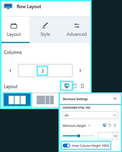
1.1 Set up the row:
- Add a Row Layout block.
- Ensure desktop view is selected.
- Choose the number of columns you need (for example, 3 columns).
- In the Row Layout Structure Settings:
- Set Inner Column Height to 100%.
This helps each column stretch to the same height, which supports consistent Kadence info box alignment across the row.
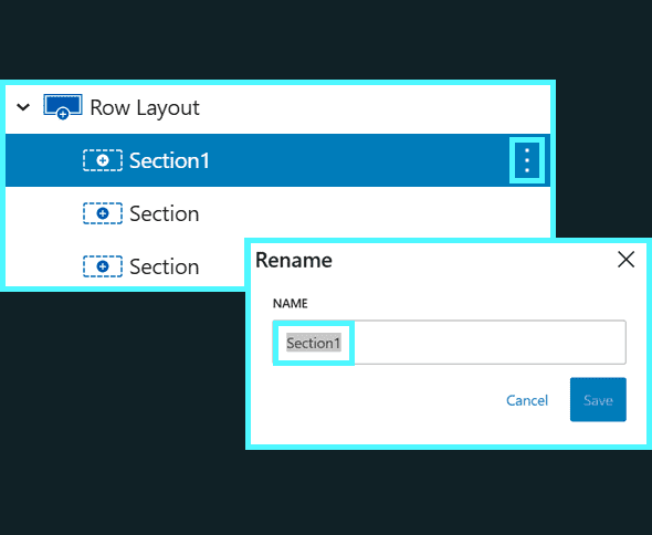
1.2 Name your first column:
- Rename the first section.
In this example, we use “Section1” to keep it simple, but you can use something more descript so you can keep track of what’s what.
You’ll build the first custom info box into Section1, then copy it.
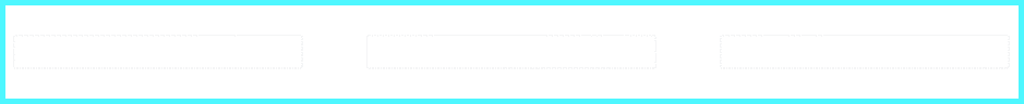
Current Progress:
You should have a simple row layout with three blank columns.
Step 2: Build your first custom Kadence Info Box (Section1)
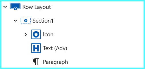
2.1 Inside Section1, create a stack:
- Add an Icon block
- Add a Text (Adv) block
- Add a Paragraph block
This will act as your base Kadence Info Box layout.
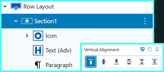
2.2 Set vertical alignment:
- Select the Section1 column.
- Set Vertical Alignment to Top (for desktop, don’t worry about mobile or tablet yet).
This keeps all content aligned from the top, giving you a stable starting point for your responsive layout.
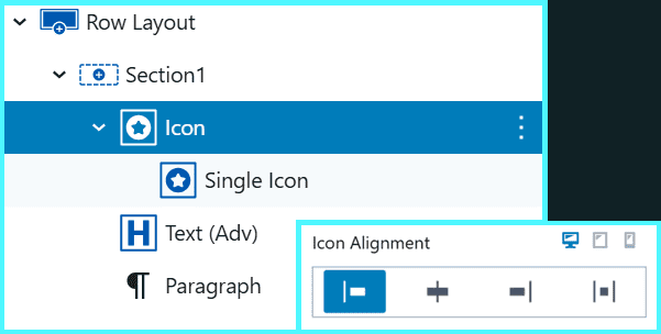
2.2 Left align the icon:
- In the Icon block, select the icon block
- Align the icon to the Left
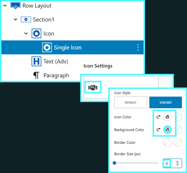
2.3 Add and style the icon:
- In the Icon settings:
- Pick the icon you want
- Set the icon style to Stacked.
- Choose an icon colour and a background colour.
- Set the border to 0px.
This gives your section the familiar Kadence Info Box feel, with a clean, coloured icon.
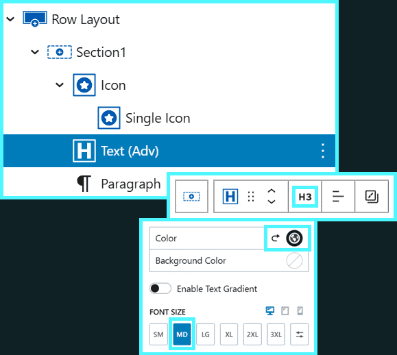
2.4 Add the Title text
- Select the Text (Adv) block
- Set the Heading Tag
- Example: If you have set a H2 heading for the parent section, you would set H3
- Example: If you do not have a parent, then set H2
- Write in your title text
- Set the text size
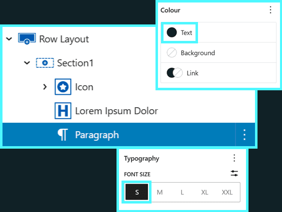
2.5 Add the Paragraph text
- Select the Paragraph block
- Add the paragraph text
- Set font colour and size for good readability
2.6 Style the outer column
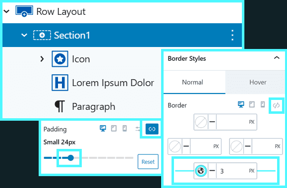
Now style the outer Section1 column to match the Info Box visually by adding bottom border and padding:
- Select the Section1 column.
- Add a bottom border:
- Turn off linked borders.
- Set just the bottom border to 3px
- Use the same colour as your icon background.
- Add linked padding (same on all sides):
- Start with SM or similar and adjust until it feels balanced.
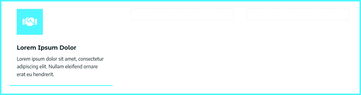
You now have a single, custom “Kadence Info Box” that you fully control.
Current Progress:
The row is now configured with the first column containing the main components, with styling, to replicate a Kadence Info Box.
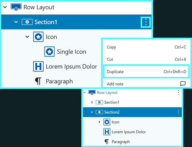
Step 3: Duplicate Section1 into Section2 and adjust content
Lets duplicate the box to make our second column
3.1 Duplicate Section1 layout:
- Duplicate the Section1 column.
- Rename the section to “Section2”.
3.2 Update Section2 content:
- In Section2, update:
- The icon and icon colour
- The title text
- The paragraph text
- The bottom border colour (match it to the new icon colour)
- Make sure Vertical Alignment for Section2 is also set to Top.
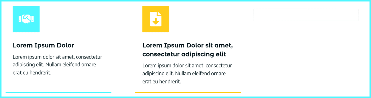
At this point, you may see a classic Kadence info box alignment problem; If the Section2 title wraps onto a second line or the paragraph is longer than Section1, your paragraphs and bottom borders won’t line up perfectly.
You have two quick options:
- Slightly reduce the text size (if it stays readable), or
- Shorten the title/paragraph so your lines are more consistent
If that’s not enough, we’ll fix it more precisely in the next step.
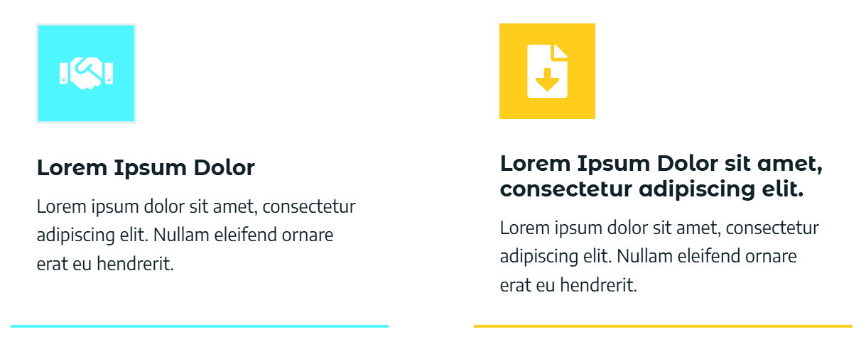
Current Progress:
The row is now configured with the second column containing the main components, with styling, to replicate a Kadence Info Box.
- Column 2 is styled with an alternative colour
- The title is longer and spans 2 lines
- The bottom border maintains alignment
- The paragraphs do not align
- Skip the next step if you’re happy with this
Step 4: Group icon and title to align the paragraphs
To control spacing between the title and paragraph, you’ll group the icon and title into a nested section.
This is what gives you finer control compared to the Kadence Info Box when developing a responsive layout across different screen sizes.
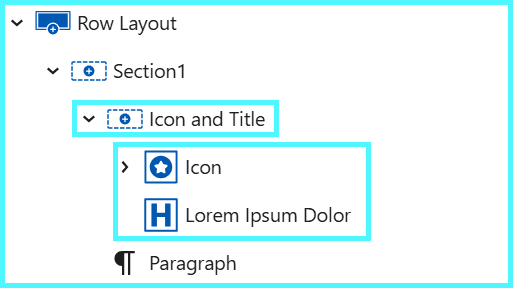
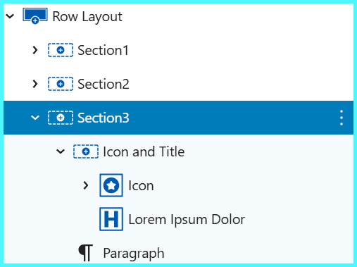
4.1 Create a nested section:
- In Section1, add a new nested section above the icon.
- Name this nested section “Icon and Title”.
- Move the icon and title into this section, stacked vertically.
- Your structure in Section1 now looks like:
- Icon and Title (nested section)
- Icon
- Title
- Paragraph
- Icon and Title (nested section)
4.2 Aligning the paragraphs:
Now lets add bottom padding to sync the paragraph alignment
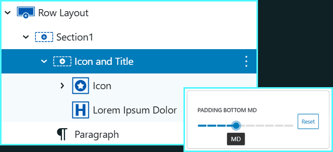
- Select the Icon and Title nested section in Section1.
- Add bottom padding until the paragraphs between Section1 and Section2 align visually on desktop.
- In this example, MD bottom padding worked well.
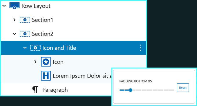
4.3 Repeat in Section 2:
- In Section2, create the same Icon and Title nested section.
- Move the icon and title into it.
- Adjust the bottom padding as needed:
- For example, XXS or XS padding in Section2 may make the titles and paragraphs align more cleanly.
- You may need to remove the padding completely
- Now, on desktop, your custom Kadence Info Box layout should look much more aligned.
This technique lets you correct for one or two extra lines of title text without breaking the overall look.
If the gap becomes too wide, the layout will start to feel strange, so keep it subtle.
Current Progress:
The the paragraph in the first column is bumped down to align with the paragraph in the second column.
If you do not wish to achieve this look, you can skip this step
Step 5: Duplicate Section2 into Section3 and adjust content
Lets now add a third section (Section3) and finish the desktop alignment
Continue to repeat this section if you need more columns
5.1 Duplicate Section2 layout:
- Duplicate Section2 and rename the new column “Section3
- Update:
- The icon and icon colour
- The title text
- The paragraph text
- The bottom border colour
- Make sure Vertical Alignment for Section2 is also set to Top.
Adjust any Icon and Title padding in Section3 so:
- The paragraphs line up neatly
- All bottom borders align along the row
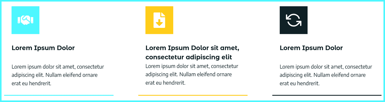
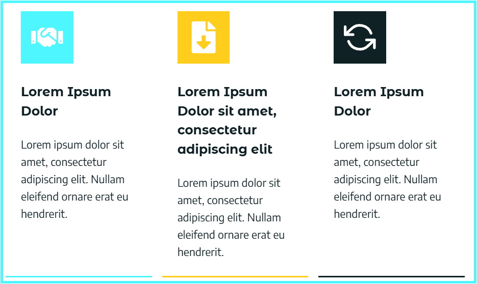
You now have three custom Kadence Info Box-style columns with strong desktop alignment.
Current Progress:
The the paragraph in the first column is bumped down to align with the paragraph in the second column.
If you do not wish to achieve this look, you can skip this step
If you skipped step 4, it might look like this with a similar padding between the Icon and Title section and the paragraph to achieve a uniformed look with aligned bottom border.
The idea here is to break out of the cookie cutter Kadence Info Box and achieve the aligned look you want.
How to keep Kadence Info Box borders aligned on tablet
Now we want to make this layout responsive and look right on smaller screens such as tablets and mobiles. On smaller screens, things can change again:
This is a common Kadence info box tablet issue. Let’s fix it.
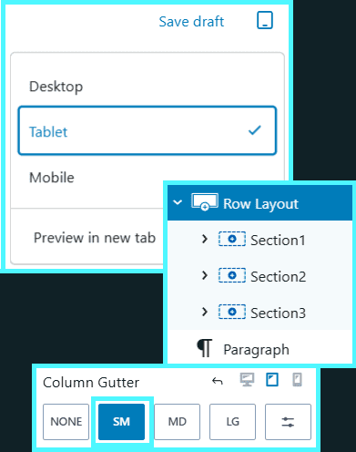
Step 1: Adjust the Kadence column gutter on tablet
- Switch the editor to tablet view.
- Select the Row Layout (the whole row).
- Change the Column Gutter to SM.
This uses the space more efficiently and keeps the layout cleaner on smaller screens.
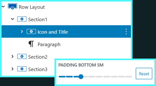
Step 2: Adjust padding for alignment:
Now fine-tune the Icon and Title padding for tablet view.
Note: In my tests, setting Icon and Title bottom padding for Section1 and Section3 to LG (so the paragraphs aligned) created too large a gap to the the title.
- Set Icon and Title bottom padding in each section to SM
You may use slightly different values based on your own design. The key is to adjust each nested Icon and Title section until the Kadence Info Box alignment looks balanced on tablet.
Current Progress:
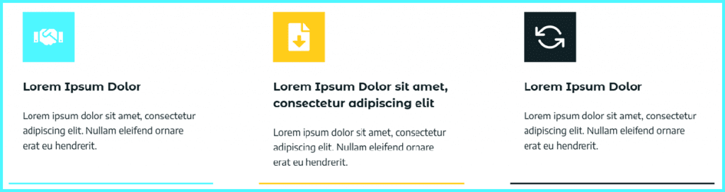
- This combination keeps the following on tablet:
- Bottom borders aligned
- Spacing between title and paragraph feeling natural
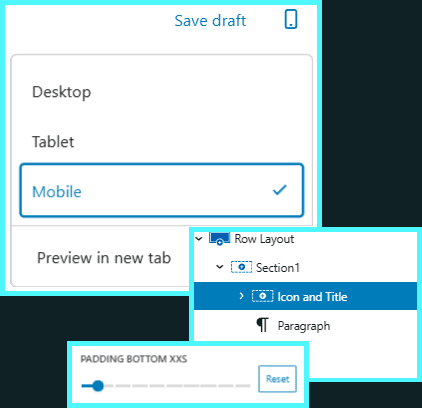
How to make your Kadence Info Box layout work on mobile
Mobile inherits spacing from tablet, so your mobile layout might feel a bit too open or uneven.
Step 1: Adjust the padding:
- Switch to mobile view in the editor.
- For each Icon and Title section (Section1, Section2, Section3):
- Set bottom padding to XXS.
This tightens the stack and makes your custom Kadence Info Box layout feel more natural on a smaller mobile screen.
Current Progress:
- Text is readable
- Spacing is even
- Nothing feels “stranded” with too much white space
FAQ: Common Kadence Info Box alignment questions
Final Thoughts
The standard Kadence Info Box is great for simple, uniform content.
But when you care about perfect alignment across desktop, tablet and mobile, a custom Row Layout-based info box gives you much more control.
By:
- Building your own Icon (or image), Title and Paragraph structure
- Using an Icon and Title nested section
- Tweaking padding per device
…you get a clean, responsive section you can copy anywhere on your site.
If you’d like another pair of eyes on your Kadence layouts, or want help turning this into a reusable pattern across your pages, this is exactly the kind of detail Seva Cloud can handle for you, so you can focus on running your organisation.
Website Services
Hello, My name is Liamarjit Bhogal, I run Seva Cloud, an all-in-one Socially Conscious, Ethical and Sustainable Web Design, Website Management and SEO service for individuals, small businesses and not-for-profits. We position ourselves as a web design business, but we design the full tech stack, not just the bits you see.
Web Design & Development
Lets create an authentic, stunning and enchanting website that speaks directly to your audience. A well planned, well designed and well implemented website will attract more visitors, increase engagement, and ultimately drive more support for your cause. Connect with your community and serve them better by leveraging our expertise in web design and development.
Website Management
With 13 years in the Industry, Seva Cloud has enterprise level experience to help your organization deliver high-quality results on a low budget. Don’t sacrifice your mission-driven work because of technical challenges. You deserve access to effective online tools, that reduce the complexity of managing a website so you can fulfil your purpose.
Search Engine Optimization
A website crafted with SEO by design, optimization and ongoing management, helps you achieve your website goals and increases your impact in the community. This establishes a strong foundation for your site, improves the website’s visibility and increases the chance of people discovering your important work by expanding your reach to a broader audience right from launch.
Seva Cloud is an impact-driven business that strives to provide essential, world class online solutions to not-for-profit organizations and small businesses. We exist to make them feel empowered and inspired to fulfil their missions, alleviating the frustration and complexity of managing their online presence and maximizing their impact in the world.
